PR/IR | Our Brand
Our Brand
CI Introduction
Whynet’s name begins with the bold question, “Why not?” We captured that spirit and our network expertise through the balance of organic curves and straight lines, expressing a future-oriented brand that pushes beyond technical limits. The blue circle and sturdy typeface symbolize global connectivity, trust, and a vision for growth.
 Color
Color
 Gray
Gray
Color
System
Main
C72 / M23 / Y6 /K0
R44 / G166 / B224
Sub
C76 / M72 / Y70 /K39
R62 / G58 / B57
Tone & Mood
C35 / M27 / Y26 /K0
R179 / G179 / B179
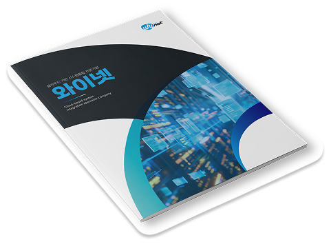
Brochure
The Whynet brochure showcases our SI capabilities across the full scope and our NI expertise spanning legacy, cloud, and SDN. It provides a clear view of our specialties, management philosophy, performance record, core solutions, and future growth vision.